TYPOGRAPHY AND HYPERTEXTUALITY - Project 2 (Font Design)
25 October, 2017 - 8 November, 2017 (Week 8 - Week 10)
Jesslyn Fabryando (0332213)
Typography & Hypertextuality
Project 2 Font Design
Lecture 8: Briefing on Project 2 (Font Design)
25 October, 2017 (Week 8)
On this week 8, we are starting our second project which is designing a font of our own. There is no lecture given rather we were just shown examples of the previous batch's font that they designed as well as our lecturers' design font. We were told that the good looking font is when we maintain the consistency of each letters of alphabets, readable and the legibility.
Lecture 9: No Lecture
1st November, 2017 (Week 9)
Lecture 10: Text/ Leading and Line Length
8 November, 2017 (Week 10)
On this week 10, we were reminded that the goal in setting type is allow for easy, prolonged reading. At the same time a field of type should occupy the page as photograph does.
Type size: Text type should be large enough to be read easily at arms length - imagine yourself holding a book in your lap.
Leading: Text that is set too tightly encourages vertical eye movement; a reader can easily loose his or her place. Type that is set too loosely creates striped patterns that distract the reader from the material at hand.
Line length: Shorten lines require less leading; longer line more. A good rule of thumb is to keep line length between 35- 65 characters.
Aside from that, we were shown all the different typeface used in an essay. We can see the difference of the color that changes because of the different thickness that each typeface has.
INSTRUCTIONS:
Project 2 : Font Design
WORK PROCESSES:
I began the project by choosing an existing font design that adheres to the direction that I would like to head in. I am studying the font carefully by analyzing its anatomical parts. The existing font that I am choosing from the list is Janson Text LT Std - Bold Italic.
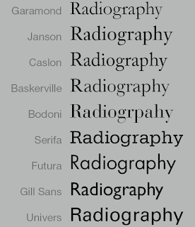 |
| Fig. 1. List of Type face that we should choose for references |
 |
| Fig. 2. The first typeface that I chose- Janson Text |
I started by sketching and it turns out there is no consistency in it. So, I refer to the typeface I chose carefully and study the type anatomy.
 |
| Fig. 3. Sketches of my font design -Janson Text typeface as my references |
As I started digitalizing it, I find it difficulty to make the letters consistent. At first, I have no idea how to trace this letters to make it consistent. Moreover, my font has this pointy curves. I created all parts of the letters such as the stem, shoulder and many more so that later on I will just copy paste it to make the different letters. However, it turns out to be inconsistent. By doing this is just making me a hard time. In the end, I decided to change my existing typeface as my references to
ITC Garamond Std - Ultra.
 |
| Fig. 4. First attempt in digitalizing my font using Janson typeface as my references |
 |
| Gig. 5. The final typeface that I use as my reference - Garamond |
Since I find it hard doing the curves and to make the letters consistent so, I change my existing typeface as my references to Garamond as my references.
The typeface that I choose as my references is a serif one. However, I will design my own font which is sans serif. I chose Garamond because I like the thick and thin strokes. I didn't sketch anymore for this typeface that I chose because there is no enough time. I directly start making the letters in Adobe Illustrator. As I started digitalizing my font, I found a similar typeface to my font that I am designing which is the 'Britannic Bold'.
 |
| Fig. 5.1. The similar typeface that I found just like what I am designing - Britannic Bold |
 |
| Fig. 6. The upper and lowercase letters |
 |
Fig. 7. The upper and lowercase letters and the punctuation marks
|
In figure 7, the punctuation mark is not consistent where the thickness becomes thinner. This makes it to be revised again so that the punctuation will be part of the group.
 |
| Fig. 7.1. The upper and lowercase letters and the punctuation marks (Revised) |
The font that I am designing is a combination of Garamond and Britannic typeface which then I come up with the name of my design font that is called Gartannic.
 |
| Fig. 8. Inserting my font from Adobe illustrator to Font lab |
In the Metrics window I adjust the kerning and the leading of the letters so that it pleases the eyes. I adjust all of these alphabets one by one even the upper case and lower case letters , numerical and also the punctuation mark. I make sure the spacing is equal.
 |
| Fig. 9. Metrics Window in Font Lab |
 |
| Fig. 10. Printed Adobe Illustrator glyph where the punctuation mark thickness is not consistent. |
 |
| Fig. 10.1. Printed Adobe Illustrator glyph (Revised) |
 |
| Fig. 10. 2. Generated Font (Final Outcome) |
FEEDBACK:
Week 8 - October 25, 2017
Mr. Vinod likes my font design. However, I need to work it out so that every alphabetical letters will be constant. To make every alphabets to be constant, Mr. Vinod suggested that I should start drawing letter ‘O’ as my base, from there I develop and expand to different alphabets. Looking at my alphabetical letters that I have done, he got confused because my font looks like being italic but at the same time it’s serif and at the same time it’s regular, so it’s not consistent and he said I need to do some work in that particular case. He said if I think there is a need to make 2 times of the letter, do it so, so that I can compare which is working.
Week 9 - November 1, 2017
When I digitize my font, Mr. Vinod commented that I am doing the hard way where I do all the part such as the stem, barb, ascenders, descenders and many more. He mentioned that he did the same way as I did before but it’s okay he said it will do. After some time, Mr. Shamsul approached me and take a look what I am doing, he saw that I am having a hard time tracing, instead he showed me to use shapes so that it is consistent as well as filling the color and use the method of pathfinder.
Week 10 - November 8, 2017
Mr. Vinod came to my table and check my work. He said my letter ’S’ is a bit off wherein I need to refine it using the curve in the letter ‘O’ as for my ‘r’ it’s a bit long, I need to make shorten it. As for my punctuation, my ‘@ and &’ is a bit weird. My numerical of 6,8, and 9 also needs to be refined. But, overall it’s consistent. I don’t have any problem in my uppercase form.
Week 11 (Extended week) - November 15, 2017
For the feedback of my font design is that my punctuation mark thickness is not consistent and it becomes thinner. I need to adjust this. But overall the alphabets are consistent. My question mark ’?’ Is too small and Mr. Vinod said it needs to reach the Cap height.
REFLECTIONS:
1. Experience
- On the eight week, I thought I am doing fine with my work. However, as I proceed doing my letter 'f' onwards it lose the consistency that I have from the first five letters on the beginning. This was a really hard task for me. From the start that he mentioned we are going to create our font, I was excited but at the same time I'm worried because I know I will face difficulty. Yet I find it cool making our own font. Putting aside that worries of mine, I am looking forward in creating this font of my own.
- On the ninth week, I am having a hard time digitalizing my Font especially maintaining the consistency. I was using shapes so that I maintain the consistency this is the first method I can think of to make it easier but it turns out not.
- On the tenth week, I always have this mistake, after I'm done revising my font, there will always be another alphabet or punctuation or even the numeric that I should revised. Sometimes there are alphabets that are not pleased to the eyes so I keep on revising over and over.
- On the eleventh week (Extended week), We extended to week 11 to finish our font design. I am so in a rush to fix my letters because I still need to fix some of the kerning when we import it to font lab. Moreover as we generated out font we need to make sure that the spacing is ok.
2. Observation
- On the eight week, I learnt that consistency really matters to make the letters look appealing to the eyes. It is also because to prevent looking the font as if it is not real. Figuring and learning the typeface anatomy is really important to keep the letters consistent.
- On the ninth week, I learnt that patient is needed in doing this font design especially digitalizing it. It is not easy. It takes a lot of time and effort in order to maintain the consistency.
- On the tenth week, I learnt that I need to be more keen observer in the transformation of each letters. I need to easily spot out the letters that doesn't feel right.
- On the eleventh week (Extended week), I learnt that if I need help I need to approach the others who are done with their work so that I will not be cramping because not enough time and ended up having late submission which I never have late submission ever since.
3. Findings
- On the eight week, For every tasks that I do, I should keep it consistent.
- On the ninth week, I found out that in order to maintain its consistency is to do a lot of practice also read some books in order to help you know better about the anatomy of a typeface.
- On the tenth week, As I do my task, I should be more critical in finding out my mistake, I cannot keep on relying our lecturer to point out which one is to be fixed. I should learn to be able to analyze out problem and have the feeling of knowing what should be fixed when it is not pleased to the eyes.
- On the eleventh week (Extended week), I should manage my time wisely, try to ask the seniors or even my friends if I am going through difficulty figuring out the problem.
FURTHER READINGS (Week 8 - Week 10)
(Forth Book) The Complete Typography (Second Edition) by Will Hill
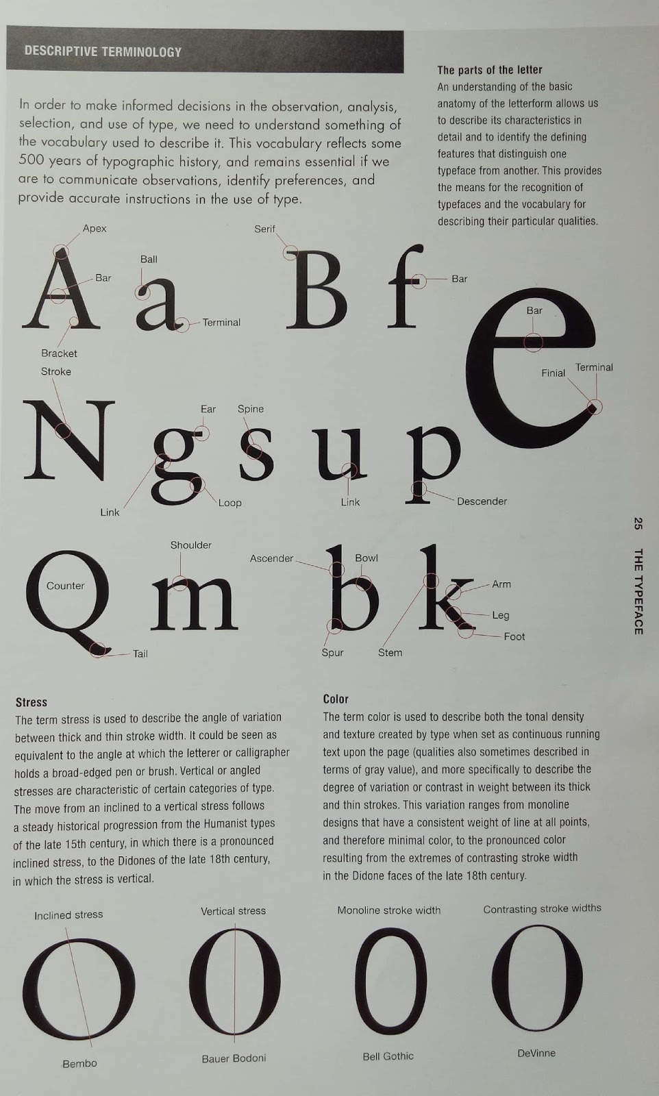
I borrowed 'The Complete Typographer' (Second Edition) by Will Hill to read further about typography. This book will be my reference to help and guide me throughout my font designing.
 |
| Fig. 1. Book 4 about working with type and the different typeface categories. |
 |
| Fig. 2. Typeface Anatomy (The parts of the letter) (pg.25) |
There are many special characters in a font. One of them is swash characters (pg.30). This swash characters are used in tilting and display, or as initial capitals to identify the beginning of a section of text.
 |
| Fig. 3. Swash Characters (Alternate Fonts) |
Page Layout - Type Size: Text for the printed page is generally set at between 9 and 12 points. Variation in the x-heights of text faces means that it may be feasible to set in smaller sizes when using typefaces os exceptionally generous x-height, while typefaces with unusually pronounced ascenders may need to be set larger to achieve the optimum legibility (page. 42)
(Fifth Book) Free Font Index by Hans Lijklema
I borrowed 'Free Font Index' by Hans Lijklema to read further about designing a font. It is a perfect book for me at the same time since I am designing my own font. This book explain you step by step how to create a good font as well as how to use the Font Lab software (Tutorials). This will help and guide me throughout my font designing.
 |
| Fig. 4. Book 5 about the different font and some tutorials |
 |
| Fig. 5. Step by step on how to use Font lab |
 |
| Fig. 5.1. Step by step on how to use Font lab |
 |
| Fig. 5.2. Step by step on how to use Font lab |
In figure 5. 2, I learnt that identifying out the gap in justified text are easier if we turn the text upside down. This prevents you from reading it, and therefore makes the gap more obvious to the eye. Aside from that we can spot the alphabets that feels not right by looking at it with an angle of depression of 45 degrees.


Comments
Post a Comment